Guide · 8 min read
Ideogram Portrait Prompts: 10 Copy-Paste Prompts for Posters, Covers and Text in Portraits
Ideogram portrait prompts that actually render the text — 10 copy-paste recipes for posters, magazine covers and profile images where typography has to come out readable.
Published October 12, 2026 · Updated October 12, 2026
Ideogram is the image model people use when the picture has to contain words. A portrait with no type is a job for a general generator. A magazine cover, a poster, or a profile card with a readable name is why you open Ideogram. The face is the photograph. The letters are the point.
These ten prompts reserve empty space, put a short string in quotes, and say to spell it as written. The titles are fictional on purpose. A real magazine logo is someone else's trademark, and the letters usually come out wrong anyway.
What are Ideogram portrait prompts?
An Ideogram portrait prompt is a layout. You say where the person stands, where the type sits, the exact words, and how those words contrast with the background. Ideogram is better at short, high-contrast text than most image models when the spelling is explicit and the face is not covering the letters.
A face that fills the frame leaves the type nowhere to go. Every prompt below puts the head in one region and the type on a flat band, panel, or margin. Thin script over hair fails. Bold letters on a flat field succeed.
One invented word is safer than four. A cover line of three or four words is the ceiling. Describe the letters by form — bold condensed sans-serif, high-contrast serif — not by a font name you expect the model to load.
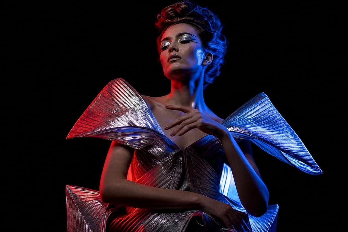
The photograph side borrows from the fashion editorial prompts on this site. Here that direction stays behind the type.
10 copy-paste Ideogram portrait prompts
Paste one block. If Magic Prompt or another rewriter is on, turn it off when the spelling has to match. Read every letter at full size before you keep the image.
1. Masthead band, face below
Magazine cover, vertical. A flat black band across the top. In that band,
the word "NORTH" in large white bold condensed sans-serif, spelled exactly
NORTH. Below it, a studio portrait, head and shoulders, face fully visible,
soft light from camera left, rust-colored top, warm gray backdrop. No other
text. No letters on the face. Keep facial structure and natural skin tone
unchanged.
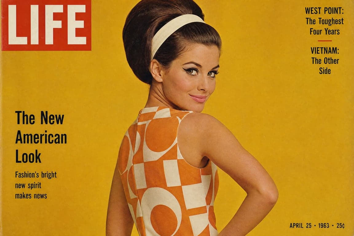
The band is what makes the word readable. The retro magazine cover portrait is the photographic version of this cover, with the type left to you.
2. Serif masthead, one cover line
Fashion cover, vertical. The word "LINE" in large black high-contrast serif
on a white margin above the hair, spelled exactly LINE. Face in the lower
two-thirds, black turtleneck, light gray seamless, soft frontal light. A
thin black bar at the bottom with "QUIET ISSUE" in small white sans-serif,
spelled exactly QUIET ISSUE. No other text. Keep facial structure and
natural skin tone unchanged.
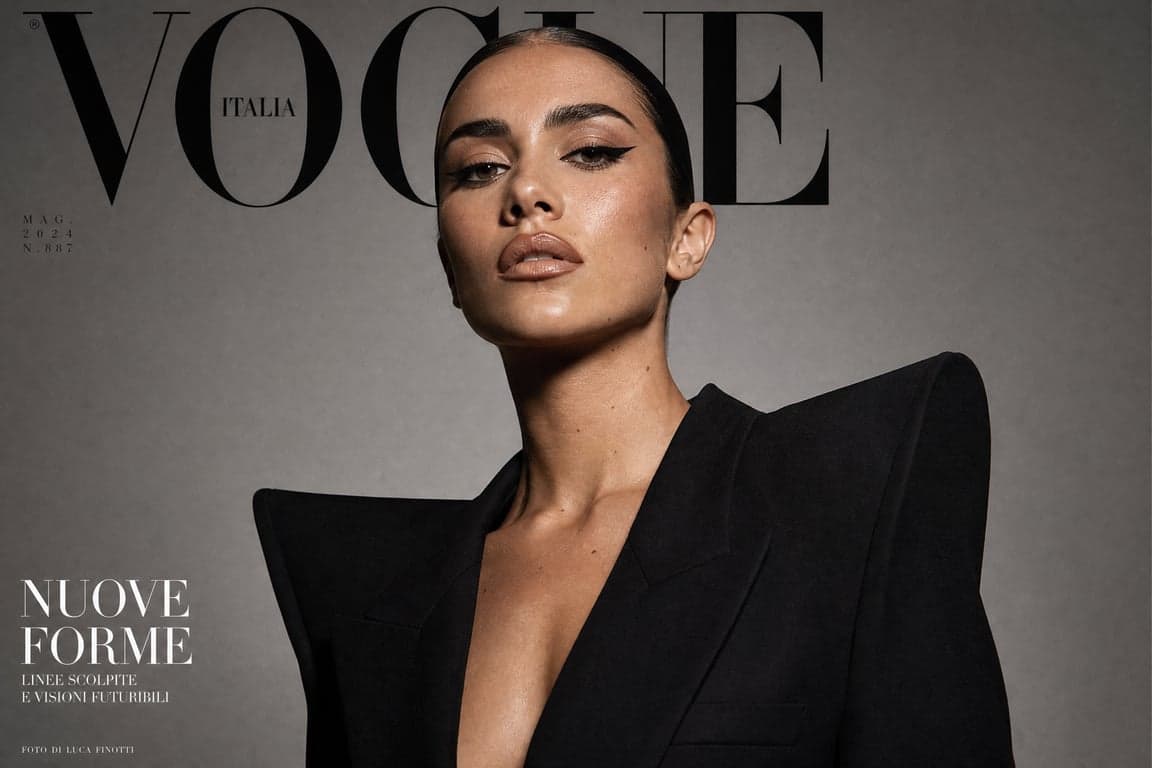
Two strings, two zones. The Vogue cover style portrait is the lighting and crop. Do not ask for a real magazine's name.
3. Poster title in the lower third
Vertical poster. Person in the upper half, waist up, dark coat, cool rim
light, face not covered by type. Lower third is a solid near-black field.
On it, "HARBOR" in large off-white condensed sans-serif, spelled exactly
HARBOR, and under it "ONE LAST TIDE" spelled exactly ONE LAST TIDE. No
credits. Keep facial structure and natural skin tone unchanged.
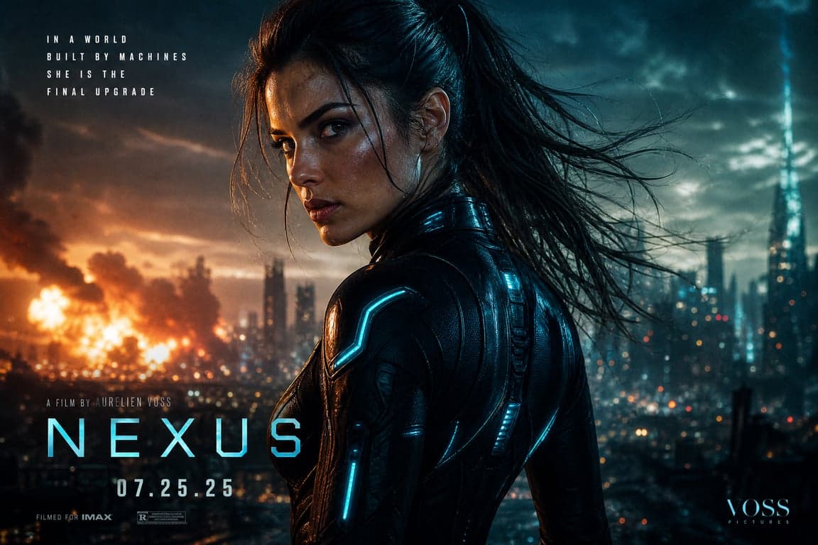
One title, one short line. The movie poster character portrait is the face and the light if you would rather set the type by hand.
4. One word, mostly empty paper
Vertical poster, off-white background, lots of blank paper. Person small
in the lower left, head and shoulders, hard side light, black clothing,
face clear. Upper right, far from the face, the word "FORM" in huge black
geometric sans-serif, spelled exactly FORM. Nothing else. Keep facial
structure and natural skin tone unchanged.
Empty space is the design. The avant-garde fashion portrait pushes the clothes harder. Keep the type to one word.
5. Concert poster, three short lines
Vertical concert poster. Upper two-thirds: a portrait under one red
overhead light, black background, no text on the face. Bottom third: a
flat black panel with three centered lines of white bold sans-serif,
spelled exactly "JUNE PARK" then "AUSTIN" then "MAY 12". No ticket line.
Keep facial structure and natural skin tone unchanged.
The flat panel is not optional. Dates break when they sit on the photograph.
6. Paperback, title and author
Vertical book cover. Close photographic portrait, muted green background,
soft side light. Top third is a solid dull-green block with "SALT ROAD"
in cream serif capitals, spelled exactly SALT ROAD. Near the bottom, on
the same color, "M. ELLIS" spelled exactly M. ELLIS. No blurb, no barcode.
Keep facial structure and natural skin tone unchanged.
Add any blurb later in layout software. Ideogram will not set a paragraph cleanly.
7. Square show cover
Square cover. Face fills the left half, even soft light, eyes to camera.
Right half is a flat charcoal panel. On it, "ROOM TONE" in white bold
sans-serif, spelled exactly ROOM TONE, large enough to read small. No
tagline, no logo. Keep facial structure and natural skin tone unchanged.
A square crop eats type designed for a tall cover. Give the words their own half.
8. Exhibition poster
Vertical poster, white background. Black-and-white portrait on the right
half only, simple light. Left half stays white. On the white: "LINA VOSS"
in black serif, spelled exactly LINA VOSS, and below it "STILL" in larger
black sans-serif, spelled exactly STILL. No dates, no address. Keep facial
structure and natural skin tone unchanged.
The white half does the job of a color band. Type needs a field with no texture.
9. Profile card, two words
Horizontal image. Left: head-and-shoulders on light gray, soft frontal
light, natural color, eyes to camera. Right: a flat white panel with two
lines of black sans-serif, "STUDIO NOTES" spelled exactly STUDIO NOTES,
and "PORTRAIT" spelled exactly PORTRAIT. No URL, no icons. Letters must
not overlap the person. Keep facial structure and natural skin tone
unchanged.
This is still a type job. A username full of dots is a worse string than two clean words.
10. Title card
Wide frame. Person small at the far left, head and shoulders, one soft
light, flat deep navy background. The right two-thirds is empty navy. On
it, "AFTER HOURS" in large off-white condensed sans-serif, spelled exactly
AFTER HOURS, one line, not touching the person. Keep facial structure and
natural skin tone unchanged.
If the letters touch the hair, the render fails even when the spelling is right.
How to keep your face looking like you
Type prompts drift faces because the model spends its attention on the letters. The same two lines still apply.
Keep the structure. "Keep my facial structure unchanged: eye shape, nose, jawline, and the spacing between features." On a cover, the model will narrow a jaw or enlarge the eyes unless you forbid it.
Keep the color. "Keep my natural skin tone unchanged. Do not lighten, darken, bronze, or smooth the skin." The black band and the white type do not require a different complexion. The grade can live in the background.
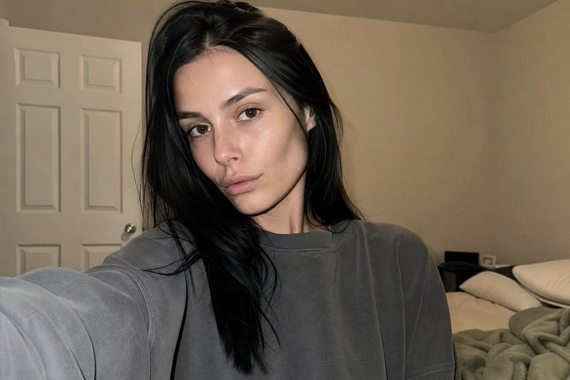
Both lines assume a reference photo when the session accepts one. From text only, they reduce plastic skin. They do not identify you.
Check the letters first: spelled as quoted, on the empty field, off the skin. Then check the face. Fix the one that failed. Do not rewrite both at once.
Ideogram-specific tips
- Quote the exact string and write "spelled exactly" next to it. "A cool title" will be invented, and it will be wrong.
- Fewer words. One masthead, or a title plus a line of three or four words. A sentence or a URL will drop characters.
- Put the type on a flat field. A band, a panel, a margin of solid color. Not the cheek, not the hair.
- High contrast. White on black, or black on white. Thin script close to the background color becomes texture.
- Turn the rewriter off. Magic Prompt will replace your quoted words. If spelling matters, it has to be off.
- Describe the letterform, not a brand font. "Bold condensed sans-serif" is a shape. A trademarked font name is only a hint.
- Use fictional titles. A short invented word is a cleaner test than a real masthead.
- One wrong letter means fewer words next time, not more adjectives.
FAQ
Why is the text on my portrait misspelled?
The string was too long, it sat on a detailed part of the photo, or a rewriter changed it. Cut to one or two short lines, put them on a flat color band, quote the spelling, and turn Magic Prompt off. Then read every character.
Can Ideogram do a realistic face and readable type in one image?
Yes, if they do not compete. Face in one region, words on a flat field in another, short text, high contrast. A title across the forehead spoils both. If you only need the portrait, skip the type and set it later.
How much text can I put on a cover?
A one-word masthead, or a short title plus a line of two to four words. Three short lines can work on a flat panel. A block of credits in the same image will not read cleanly. Add the long copy outside the generator.
Back to all guides